


Google Home app just got a slick Material 3 media controller update for Android, and yes, it finally feels modern. No more fumbling through clunky menus just to pause a podcast! This new, pill-shaped design makes it easy to play back media on Nest devices and enhances the overall user experience within Google’s smart home ecosystem.
What’s Actually New in the Media Controller?
A Fresh Visual Style That Fits the Future
Google didn’t just round some corners and say, “Alright users! We hear you, this is our new design!”
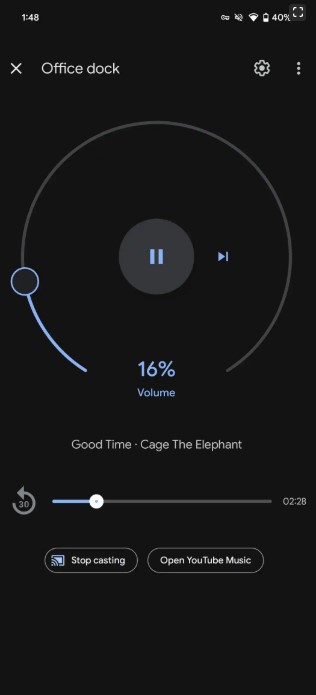
The media controller has been completely redesigned in the Google Home app. It now floats above the app interface as a pill-shaped panel anchored to the bottom of your screen, instead of sitting rigidly inside a device tile.
That’s not the only change we see; the biggest shift is with album artwork, it sits front and center, and looks bigger. It’s framed by play controls with high contrast and uses Google’s new iconography and spacing. The words are no longer hard to read when you’re casting across multiple devices, and the screen isn’t cluttered, with only essentials on the screen.
Another noticeable change are the animations, they look more fluid when the controller appears or updates. These spring-like animations make the app feel more alive without distracting the users.
The changes implemented on animations aren’t just about aesthetics; the motion helps guide your attention, especially when you’re juggling music, lights, and other devices at once.
Controls That Get Out of Way, Until You Need Them
One of the smartest changes that grabbed my attention was the controller’s new behavior. It only shows up when it matters. If you’re not playing anything, it goes away, helping the user focus on what actually matters in a smart home control app, the smart devices. There are no signs of stale media cards that take up space long before you’ve stopped casting; not anymore.
When media is active, like casting Spotify to your Nest Hub, the controller slides in at the bottom of the screen, somewhere that’s easy for your thumb to reach!
The controller stays accessible without getting in your way. This is especially perfect times when users are multitasking with lights, cameras, and multiple routines at once!
Responsiveness is also another important factor that Google has paid attention to in this new Material 3 redesign for Google Home. On foldables and tablets, the layout stretches well, keeping controls readable and touch-friendly. This kind of adaptive behavior was lacking in the old versions and frankly, it felt so cheap.
How Is This Material 3 Redesign Better Than the Old Design?
It was only a matter of time before any homeowner in Google’s ecosystem to realized that the media controller feels like an afterthought; a flat, rectangular card buried in your list of devices.
It was easy to overlook and slow to update, and often, didn’t reflect what was actually playing. You had to hunt for it and the amount of attention it needed felt like a disaster over time!
With this latest redesign, the controller makes more sense. The floating panel grabs your attention just enough, without hijacking the whole screen. Controls are neatly spaced for faster taps, album art is more visible, and the playback state is clearer at a glance. It’s just easier to use, or as they say, more user-friendly.
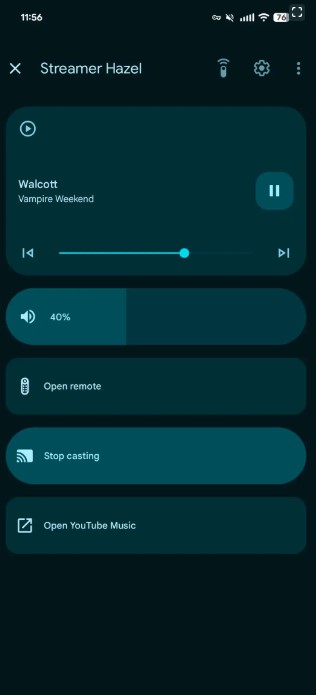
When you’re casting to supported devices like Google TV, you can now see smart context-based buttons, like “Open Remote”, “Stop casting”, or “Open app”. Also, Nest Hub Max users get a “View Nest Cam” shortcut. Active buttons show up as bold pill-shaped actions, while inactive ones get a softer, rounded rectangular style.
Is This Part of a Bigger Google Design Push?
Yep. It’s Material 3 Everywhere
Google’s Material 3 redesign isn’t just limited to the Google Home app. Google’s been steadily rolling out Material 3 updates across many of its core apps, Gmail, Google Phone, Keep. This redesign started long before reaching Google Home.
Smart Home UX Is Finally Getting the Attention It Deserves
While this update may not seem like a big deal overall, it signals something bigger. This new UI reflects a shift toward what Google calls “ambient computing”; tech that blends into your life and surfaces only when needed.
This is exactly what this new controller is about, it appears when media is playing, and goes away when it’s not.
For many years, Google Home felt like a utility to me. It’s always been functional indeed, but not as enjoyable as I want my apps to be. With these new movements through modern aesthetics, I believe the future of the Google smart home ecosystem is bright.
Can I Get the New Material 3 Redesign for Google Home App Update Now?
If you are on Android, the answer is likely yes, the Material 3 media controller is rolling out now through the Google Home app. Just play some media and you’ll see it appear, you don’t have to change any settings or toggle anything.
That said, the rollout seems tied to recent versions of Google Play Services and possibly Android beta builds. If you’re not seeing it yet, make sure both your Google Home app and system services are up to date. A reboot never hurts either, it’s Google we’re talking about after all.
Google Home version 3.35 first referenced this as a “Cast Controller refresh”, promising faster performance and more reliable controls. The new look is now showing in version 3.37 for Android users enrolled in the Public Preview. If you’re not seeing it yet, you’re probably outside the preview or on an earlier build.
How About iOS Users?
There’s no word yet for iOS. For now, and by the end I finish writing this news article, the update appears exclusive to Android, and there’s no timeline for an iPhone release. This was predictable, though; Android always gets first dibs on Google’s design updates.
Final Thoughts
This update won’t shout at you, but it doesn’t need to. The new Material 3 redesign for the Google Home app promises bigger changes to smart home control on Android in the future and hopefully, it means Google is finally investing in making the smart home experience smoother and more intuitive.